Logos and symbols
The logo is the main identity of Softronic. Although Softronic’s logo is red, a white version can be used against a dark background. There is also a symbol, which can be used instead of the logo in certain situations.
Here are a few simple guidelines for using the logo and the symbol.
The logo
- The proportions of the logo may not be changed.
- The colour of the logo may not be changed.
- The logo may not be used in body text.
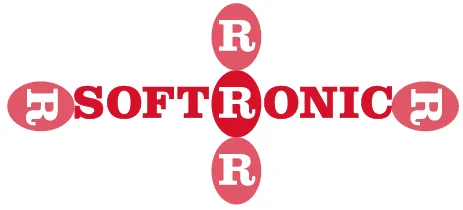
Free zone and minimum size
The free zone is the minimum distance to other graphics, text or images. The free zone is a minimum distance – the more free area there is around the logo, the clearer the logo will be.
- The logo’s free zone = The height of the “R” symbol in the logo (see image below).
- The width of the logo may not be less than 18 mm in printed material.
The symbol (avatar)
Softronic’s “R” symbol must only be used if the logo would otherwise be too small to be seen sufficiently, i.e. if it would be difficult to see the text in the logo.