
Converting a complex interface into a clear and user-friendly interface does not have to be complicated. By highlighting the most important information and hiding the less important information, you can save your users both time and energy, as it will be easier for them to find information on your website. This is because the Progressive Disclosure design principle prioritises information based on relevance. Ellinor Diring, a UX designer, has written a guide on how to follow this design principle to avoid the users of your website being overwhelmed by all the information.

It is easy to think that if you display all the user options directly on your website, it will be easier for users to find what they are looking for straight away. Although this might sound good in theory, it normally results in the users feeling overwhelmed and leaving the website to search on another site that offers similar services.
Our brains are programmed to save energy and do not like to waste time on anything that seems uninteresting. This is why the brain first processes general information by quickly scanning the content. When it finds something that seems interesting, it will want to examine this information in more detail. If a website has a complex structure, it takes longer for the brain to scan it, which means that the brain has to work harder. When there is too much information vying for your brain’s attention, it will not know where it should start to focus. It will then use too much energy scanning the interface and will have less energy left over to interpret and understand what you are seeing. If we use the Progressive Disclosure design principle, it makes it easier for our users to access the information. This is a guide with 4 steps that show you how to apply this design principle to a website:
#1 – Prioritise the information
If we are going to use this design principle, we need to know which functions and features are used most by the users of your website. Do not just think about which information the users need the most – perform a usability test to discover what the real answer to this question is. This will show you which information they hop over, what they expect to be included and what they think about the current information structure and the interface. Using this data, you can then prioritise the information based on what information is critical for users to achieve their goal, and what information is secondary for most users.
#2 – Highlight primary information
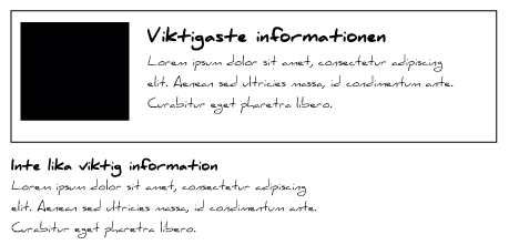
Once you have found out what the most important information on the website is, you need to highlight it to make it clearly visible. If elements have the same visual dominance, they will compete with each other for the user’s attention. So by setting different weighting to the elements, you give the users a better overview. Use different colour contrasts and sizes to highlight the most important information.
#3 – Hide secondary information
Any information that the user does not think is interesting creates a distraction and prevents the user from staying focused on their goal, compared with a more minimalist interface. This is why it is important to hide everything that does not normally add anything for the user. There are various methods for hiding secondary information.
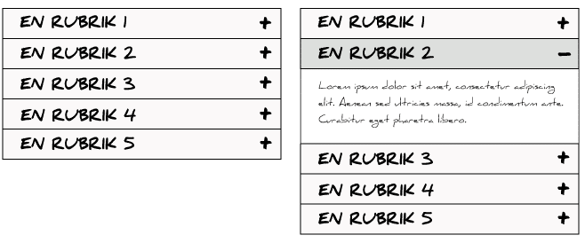
You can use what are known as ‘accordions’. Accordions hide secondary information, while making it easily accessible if the user needs it. When the user sees an accordion header, they themselves can choose whether or not to read more information about the topic in question.
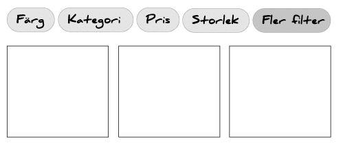
Another way of hiding information is to collect all secondary options in one place. For web shops, you often see the option ‘More filters’. This is where you collect options that you know fewer users choose.
4# – Divide the information
You can also help the user by dividing the information into several steps. This makes it easier for them to get a quick overview without having to scan through large amounts of information. One good approach is to help users focus on one thing at a time.
But remember – too many steps can also be frustrating! So do not divide information into multiple steps unnecessarily.
The primary information has to dominate the interface, so it is a good idea to combine it with blank spaces, known as ‘white spaces’. White spaces can create clearer groupings and make the interface easier to read. As the primary information is more clearly highlighted, it allows the users to process the information that is there before making a decision.
Summary
Progressive Disclosure is a design principle that is relatively easy to follow using just a few steps. You simply have to prioritise information, highlight primary information, hide secondary information, and divide complicated information into several steps. If you do this, you can avoid overwhelming your users, and instead offer them a great user experience.