Every time a visitor comes to your website or is faced with a specific task on your website, they will ask themselves the question, “Is it worth it?”. They perform what we call a risk/reward assessment. The less information a user has, the more difficult it is for them to assess the risks, making it less likely that they will perform the task. In this blog post, Ellinor Diring, an experienced UX Designer, writes about the Predictability design principle, which makes your website more predictable.

Imagine a thief at a car park, who is looking around the cars to decide which one they will break into. They are more likely to choose a car where the valuables are visible, because they can assess that the risk of being caught is worth it for the reward they will receive: the valuables. This risk/reward assessment works in a similar way for users of a website. The difference is that the risk is the user’s time.
In this post I am going to look at three tips for making your website or service more predictable – so keep on reading!
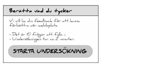
#1 Show how long it takes to perform a task
The user does not want to waste their time, so it is important to be able to give them information about how long something will take to complete, wherever possible. If you are sending a feedback form, always include the number of questions they have to fill in and how many minutes it will take to complete. There is a big difference between writing ‘a few’ minutes and ‘approximately two’ minutes. The more specific you are, the easier it is for the user to make an assessment as to whether it will be worth spending their time on your website.
#2 Explain what the user has to do
It is a good idea to break large tasks down into several stages (for more information about this, read the blog post Progressive disclosure). If you have a task that goes over several pages, it is a good idea to use ‘steps’, which shows which steps are involved and which step the user is currently on. This allows you to explain to the user what they have to do to buy a pair of shoes, for example.

#3 Explain what the user will get
Make it clear what the user will get from completing a task. If the task is registering on a website, make it clear what the registration involves even before the user starts the registration process.
Summary
It is a good idea to make a website predictable, as this gives reassurance to a user and makes them more inclined to stay and perform various tasks. You can make sure they do this by following a few simple steps… :
- … showing the user how long it takes to perform a task
- … explaining what the user has to do
- … explaining what the user will get
Accessibility Check
We can provide an Accessibility Check of your website.